January 15, 2012

Great UX patterns in games

EarthBound is one of my favorite Super Nintendo games. It's witty, hilarious, and extremely fun. I played this game over the holidays and discovered one of the best user experiences in a video game.
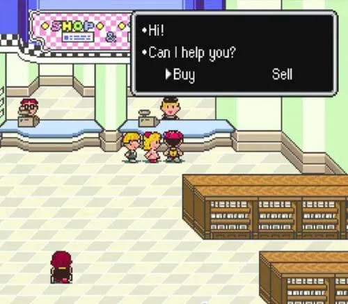
Clerk asking if you would like to buy or sell an item
You go to a store to purchase a new item
Character panels showing the item you are about to buy is better than your equipped item
A character's panel will blink if this item is stronger than their currently equipped item
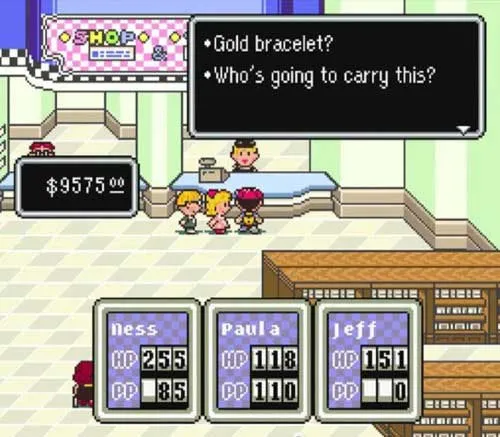
Clerk asking who should carry the new purchase
When you select the item, the clerk will ask who should carry it.
Clerk asking if you'd like to equip the item after purchase
Once you select the party member, the clerk will ask if you'd like to equip your purchase at this time.
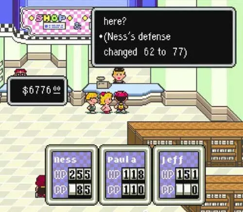
Clerk reporting your character's new defensive stats
If you say yes, the clerk will inform you of your offensive or defensive improvement.
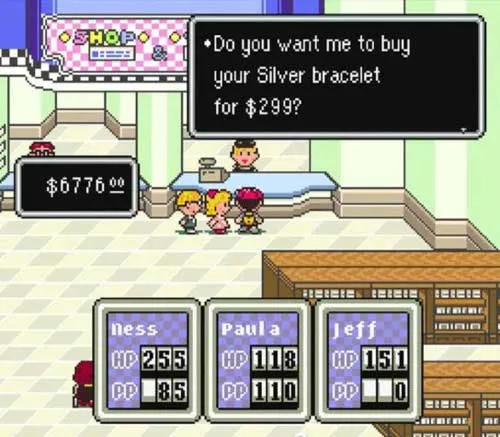
Clerk asking if you'd like to sell your previous, unneeded item
And, finally, the clerk asks if you'd like to sell your older item.

This is one of the best video game experiences I've had.

In one dialog, I bought a better item, assigned it to the correct character, got rid of my older item, and made cash on it. The game walked me through a process that would normally be tedious and kept me focused on what's important: gameplay. Less organization, more gameplay.

Want to develop a great user experience?

Become a user yourself!


Credit to Stephan Plays for the high resolution video of EarthBound gameplay